
The Seattle Sounders and Seattle Reign are clearly the coolest soccer teams in existence. Here are my designs from over the course of the last seven years that express my love for the Eternal Blue, Forever Green and the Blue & Bold!
Though until now the teams have separately owned, I've always been obsessed with imagining them in branding alignment as if the organizations were to merge. Now that seems to be a strong possibility, I'm sharing all of the designs I've done!

Team Logo History
A quick recap for those not in the know.


2023
Concept 8 — 50th Anniversary Brand Tweak
Concept 8 — 50th Anniversary Brand Tweak
The Sounders just released new logos as part of our 50th anniversary celebration in 2024. I think the real thing is a big improvement on our previous MLS-era logo, but it could use a couple more elements and some minor tweaks IMO.
The NASL wave and orca, which are included in the IRL brand package as secondary logos only, are now both integrated as elements in the primary logo and wordmark for a more cohesive set.
I additionally imagine a synergistic Reign logo in case the upcoming sale of the NWSL team goes to their MLS co-tenants.
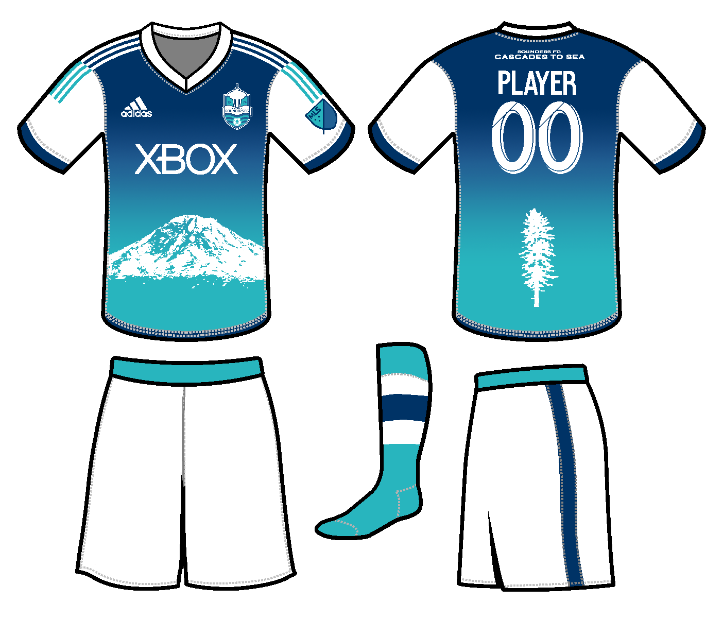
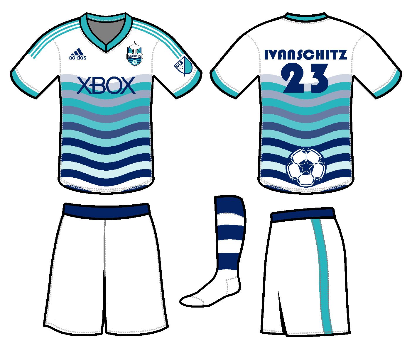
The Sounders home jersey uses a sublimated pattern of the NASL-era waves, ascending northwestward in diagonal hoops.
On the away is an aqua jersey with a hoop inspired by the 1994 home jersey's sleeves.
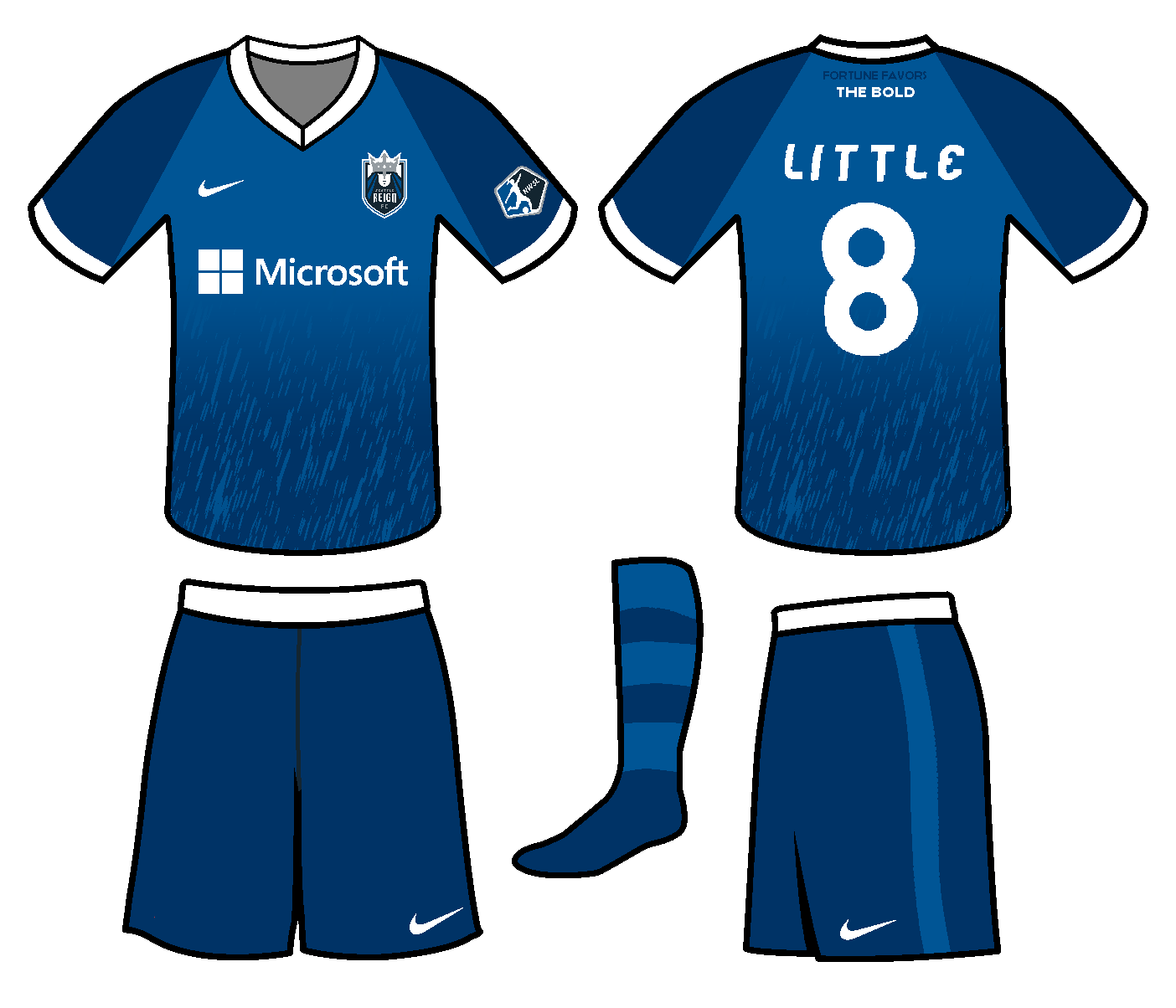
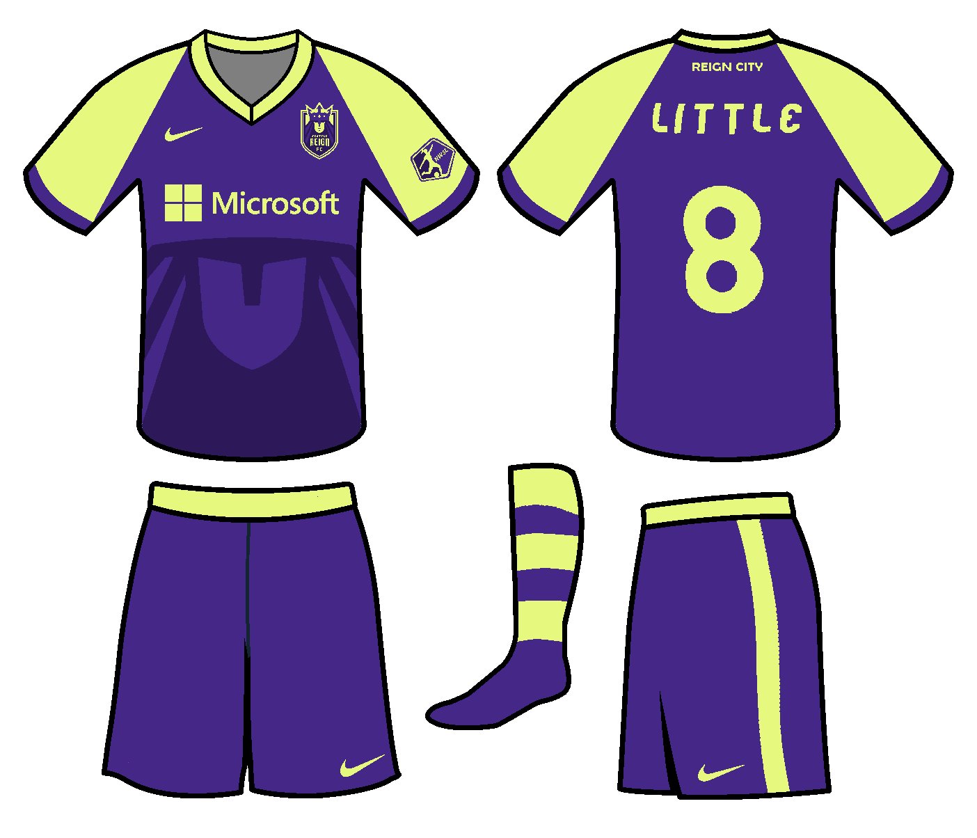
At home, the Reign boast a barber-pole design inspired by our 2015 training top, with logo elements as a pattern.
On the road Reign jersey, I use an ant's-eye view of the famous arches at the team's old neighbor, the Pacific Science Center.
On the away is an aqua jersey with a hoop inspired by the 1994 home jersey's sleeves.
At home, the Reign boast a barber-pole design inspired by our 2015 training top, with logo elements as a pattern.
On the road Reign jersey, I use an ant's-eye view of the famous arches at the team's old neighbor, the Pacific Science Center.


2023
Concept 7 — Forces of Nature
Concept 7 — Forces of Nature
Before the release of the new logo, Sounders fans seemed divided about if the team should return to the '90s orca, depict Tahoma, or keep the Space Needle, so I wanted to see if I could design a primarily orca-themed logo with all of the above. The orca appears above the team's classic waves in front of the silhouette of Tahoma, and hides an abstract Space Needle on its belly (à la Kraken secondary logo.)
The same Space Needle render appears in the Reign's crown, with the same Tahoma render below the monarch.
Sounders fans have sometimes asked for hoops, so the home jersey is an attempt at wavy hoops. The away is based on the 2014 third nicknamed "Nuclear Orca" by fans, but with an added Seattle skyline pattern in diagonal pinstripes.
A 2014 fauxback for the Reign at home, but with rain patterning from the crest. On the road, the team sports a harbor porpoise-inspired monochrome jersey. (Also I know PTJ wouldn't wear an outfield jersey but she's a marine biologist so I had to! And best of luck to her in Manchester; we'll miss her dearly!)


2018–2019 (updated 2021)
Concept 6 — Emerald City Heritage
Concept 6 — Emerald City Heritage
This Sounders design was originally made in 2018, but it took until 2019 to complete the Reign logo (in preparation for my 2020 NWSL series). Both logos were tweaked during my my 2021 MLS redesign series and 2022 updates to the NWSL series.
The Sounders logo gets a new Space Needle, done from scratch, inspired by 1983 logo. The 4 NASL-style waves represent our 4 pre-MLS titles. The crest is contained in a hexagonal emerald shape.
The rain-haired monarch returns from the Reign's inaugural logo, now appearing above the mountains of her domain.
The Sounders home jersey uses a tesselated hexagon pattern to form an abstract landscape.
The away jersey is a 1982 fauxback design with sublimated waves from the Seattle city flag. (Note: this jersey design predates the very similar Ballard FC jersey!)
The Reign home jersey puts a rain pattern in the shape of the coastlines of Washington state.
The away jersey incorporates the needles of the native western red cedar into an abstract mountain design.


2022
Concept 6.5 — Gem of the Emerald City
Concept 6.5 — Gem of the Emerald City
A simple reworking of Concept 6 to use a more distinctive gem shape and a Space Needle closer to the 1983 logo.
At home, the Sounders sport a tesselated pattern of sparkling gems on a blue-green gradient.
Away, the team wears a loose 2006 throwback, with the center stripes formed by the wake of a ferry.
The Reign get a photograph of the Olympic Mountains over the Sound at home. A simple idea that surprisingly hasn't been used yet in Seattle soccer!
On the road, a vertical stripe alternates between "REIGN" nautical flags and Pride flags.


2017–2019 (updated 2023)
Concept 5 — Classically Cascadian
Concept 5 — Classically Cascadian
An abstract Space Needle and roundel for the Sounders, which I made in 2017. I think one of the oldest MLS teams could afford to look the part, in that sense, so I also added vintage white.
The monarch on this Reign logo, which I made in 2019, is incorporated into mountains, with cresting waves underneath. I came up with the "Salish Sea" moniker during the stint in Tacoma, since I felt the team should still have a location in its name.
Both teams use the Market Deco font from the Pike Place Market sign.
For a classic look, the Sounders wear two fauxbacks.
At home, a 1978 fauxback with a streamlined take on the checkerboard from the current 2022 jersey. On the road, a simple pinstriped 1983 fauxback.
The Reign go plaid for the home jersey, with the hoop from our inaugural home jersey.
For the road, we go with a Gasworks Park-inspired jersey.


2016 (updated 2022)
Concept 3 — Sound Waves in Motion
Concept 3 — Sound Waves in Motion
I originally made this concept in 2016 by combining the existing logo with a then newly-posted concept on Sounder at Heart by Jasmine Woo (who went on to redesign that site's logo!)
Then, in 2022, James Woollard (official stadium announcer for the Sounders) posted my design on Twitter, leading him, Jasmine, and myself to all riff on the design until reaching the Sounders logo you see here. Check out the graphic on my website to see all of those designs.
The Reign logo I designed myself to match, with the monarch's face and hair being hidden in mountains, and the crown forming a raincloud. For this set, both teams get music-inspired jerseys in the vein of the Sounders' IRL Hendrix kit.
The Sounders get a home Nirvana kit inspired by Kurt Cobain's famous sweater from the Smells Like Teen Spirit video, and a black & white Sub Pop away kit.
The Reign wear a home jersey with a wave pattern inspired by Heart's logo, and a pink punk-aesthetic away kit as tribute to the Riot Grrrl movement.


2016–2023
Concept 2 — Spirit of '83
This concept merely simplifies the 1983 Sounders logo. For the Reign, I created a matching crown version with rainclouds instead of waves. I wanted to do this for the Reign because I remember back in our Memorial Stadium days, the team would occasionally have novelty Twitter profile pictures that were Reign versions of retro Seattle logos. They had a Supersonics skyline logo with a soccer ball instead of a basketball, and they had a version of the NASL Sounders wavy wordmark that said "Seattle Reign." I can't find them archived anywhere, but that basic idea inspired this Reign version of the '83 Sounders.
Navy blue and pinstripes make the home "Midnight Rain" Sounders jersey into a loose 1983 throwback (with hints of the 2016 "Pacific Blue" alt jersey) to pair with the logo.
The Sounders' change kit shows a Washington State Ferry in the inaugural NASL colors.
A triangle pattern adorns the home Reign uniform.
On the road, the Reign wear a jersey inspired by the skylights of Underground Seattle.
The Sounders' change kit shows a Washington State Ferry in the inaugural NASL colors.
A triangle pattern adorns the home Reign uniform.
On the road, the Reign wear a jersey inspired by the skylights of Underground Seattle.


2016 (recreated 2023)
Concept 1 — Unified Shield
Concept 1 — Unified Shield
Folds the Sounders brand into the existing branding of the Seattle Reign by using the latter team's shield shape. The Sounders logo retains the current logo's Space Needle and text treatment, while reintroducing 1974 / NASL-era waves and ball. The four stars represent our four pre-MLS titles ('95, '96, '05, '07). Since the Reign are a double-blue team, the Sounders revert to the blue & teal team colors used in 1983 and 1994–2002. For my very first ever go at jersey designs for the Reign, I figured there was no need to fix what clearly wasn't broken!
These jerseys are recreations of designs from 2016, some of my earliest soccer designs, which I originally made using this strange Paint template.
The Sounders get a gradiented home jersey featuring Tahoma (aka Mt. Rainier) and an wavy away jersey. (Original: Home, Away)
The Reign uses a rainy double-blue home jersey, and a take on our 2015 third jersey with logo-inspired patterning for the away. (Original: Home, Away)
The Sounders get a gradiented home jersey featuring Tahoma (aka Mt. Rainier) and an wavy away jersey. (Original: Home, Away)
The Reign uses a rainy double-blue home jersey, and a take on our 2015 third jersey with logo-inspired patterning for the away. (Original: Home, Away)


2022 BONUS: Tacoma Defiance / Tides (men's minor league affiliate)
It seems that, unfortunately, the Tacoma Defiance (and Tacoma outdoor soccer) are probably not long for this world, but nevertheless here's a couple of concepts!
IMO, the IRL Defiance logo has way too much detail in some places (waves, tentacles) and way too little in others (boat, roundel container)... and the composition is just not great. I just attempted to simplify the design and make it cohesive, while also adding a bit of Tacoma soccer history. I add a ship wheel, cuz why not? The waves and wordmark idea are inspired by the original 1976 Tacoma Tides team of the American Soccer League.
The home jersey is dark dark gray, with a Museum of Glass design. The away is a 1976 Tides fauxback, with subtle chevron stripes based on the iconic East 21st Street Bridge.
On the other hand, Tacoma Tides is the name they should have gone with, IMO. The Tides name has history from 1976 (in the American Soccer League) and from 2006 to 2011 (in the USL PDL, now USL League 2), making it by far the biggest name in Tacoma outdoor soccer. The name only died again when the Sounders bought the team and de-branded it "Sounders U23." (This was in the sorta 2008-2013 era where the Sounders seemed to want nothing to do with local soccer history for some dumb reason.) It seems right to restore a legacy brand to the region!
The logo uses a font (Clarendon Wide) that splits the difference between the 1976 and 2007 Tides, and showcases Tahoma over the East 21st Street Bridge and a 1976 Tides-style wave. The alternate logo is a straight 2007 Tides fauxback logo.
At home, the team wears a gray Tacoma Dome triangle-patterned jersey. On the road, the Tides wear a 2006 fauxback yellow jersey with an East 21st Street Bridge 3/4 profile view.

2023 BONUS: 50th Anniversary Celebration
And lastly, what the Sounders really should be wearing in 2024! 1978 fauxback at home. 1982 fauxback on the road. 1994 fauxback third. 'Nuff said.


/cdn.vox-cdn.com/uploads/chorus_asset/file/23081711/939A1672_830D_4743_8F5C_6BDFFC7FC176.png)